No Products in the Cart
We have been busy creating new products - Take a look here New Products


Listen to our podcast here on Safety Colors:
Welcome back to Mighty Line Minute! I'm excited to explore a topic that's near and dear to my heart, and I hope it's enjoyable for you too. Today, we're diving into the fascinating world of safety colors and its multifaceted role in our lives, both at home and in the workplace.
Color isn't just about aesthetics - it's a powerful communicator. Think about the vibrant hues of the psychedelic era, with shades like tangerine, lime, and cobalt blue. Sherwin-Williams aptly describes these colors as "cheerfully saturated, bringing brightness and life to our everyday experiences.”
Remember the mesmerizing color displays behind Jeff Beck, Prince or Muse as they performed onstage? It's incredible how color captivates our senses, enhances our perception, and locks-in vivid memories.
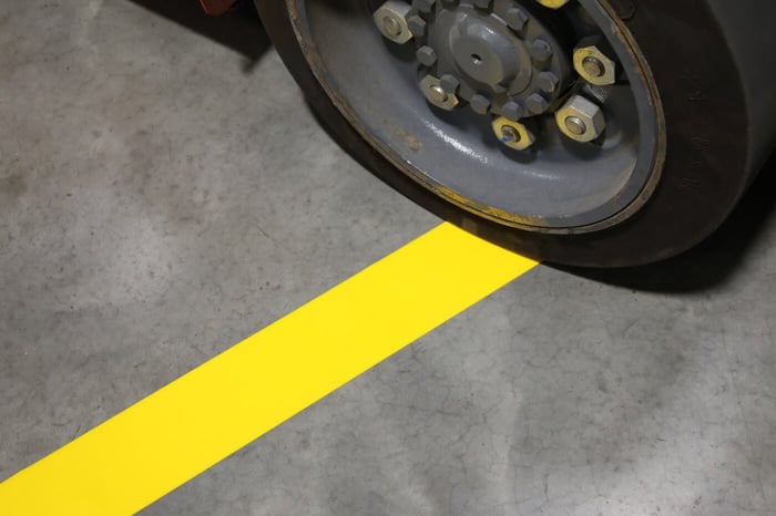
Beyond mere visual appeal, color plays a critical role in Safety. From the iconic yellow of school buses to industrial floor tape in warehouses to the unmistakable red of fire extinguishers, color is a language of safety, conveying vital information to keep us safe from harm.
But color isn't just about safety—it's deeply intertwined with our emotions and perceptions. Reflecting on my high school Humanities class, I recall my teacher's reluctance to define the word "aesthetics." Like color, aesthetics defies rigid definitions, inviting personal interpretation and reflection.
Color holds different meanings for each of us, resonating in unique ways, based on our individual experiences and perceptions.
As we continue our journey through the world of color, I invite you to explore its significance and discover how it can enrich your environment and personal experiences.
Over the coming weeks, we'll delve deeper into color standards and their effectiveness in promoting safe behaviors. I'm eager to share insights on how you can enhance safety in your workplace through strategic color implementation.
Please enjoy our blog on the Significance of Safety Colours below:

Welcome back to our exploration of the fascinating world of color, where we examine the pivotal role of safety colors and meanings in our daily environments, including at home and in the workplace. In this article, we delve into the topic of 'Safety Colors' - a critical element of visual communication that transcends aesthetics to convey essential information and promote safety. Join us as we uncover how the strategic use of safety colors can bolster safety and efficiency in your professional setting.
Color transcends mere aesthetics; it serves as a potent communicator. In the cheerfully saturated hues of the psychedelic era, with shades like tangerine, lime, and cobalt blue, we find an energy that Sherwin-Williams describes as bringing brightness and life to our daily experiences. From the captivating color displays accompanying performances by Jeff Beck, Prince, or Muse, we witness how the strategic use of color for safety captivates our senses, elevates our experiences, and imprints unforgettable memories, answering the question of what are the colors of warning signs indicating upcoming hazards with vivid examples.
Beyond its visual allure, color is a fundamental component in the language of safety. From the iconic yellow of school buses to the strategic placement of industrial floor tape in warehouses, and the unmistakable red of fire extinguishers, the safety color code is a universal language. It conveys critical information and serves as a beacon for the color of safety, guiding us away from potential harm and answering the question, 'What are the colors of warning signs indicating upcoming hazards?' with unmistakable clarity.
Safety colors are more than mere visual cues—they're intricately linked with our emotions and perceptions. Like aesthetics, the color of safety transcends rigid definitions, encouraging personal interpretation and contemplation. The significance of safety colors resonates with us in diverse ways, echoing through our individual experiences and shaping our understanding of the world around us.
In the domain of safety, distinct colors are globally recognized to signal specific dangers, actions, or equipment. For instance, red is synonymous with severe hazards that could lead to grave injury or death, while yellow cautions us of less severe hazards that may cause minor to moderate injuries. The intentional application of the safety color meaning helps forge a safer environment by offering unmistakable, visual cues for individuals to heed.
As we explore color standards and their role in fostering safe behaviors, it's crucial to grasp the specific connotations associated with various warning sign colors. Understanding these meanings, which are often outlined in OSHA color coding, enhances our ability to navigate spaces safely and respond appropriately to potential dangers.

Red, a color that commands attention, signifies danger or the need to halt, often marking fire protection equipment or emergency stop devices. This safety color can also delineate restricted areas or indicate the presence of fire safety apparatus, playing a vital role in maintaining safety protocols.
The vibrant orange safety color is strategically employed as a safety color to underscore potentially hazardous zones on machinery or live equipment, serving as a conspicuous warning. This critical alert is especially crucial when protective guards are open or removed, prompting individuals to exercise increased caution.
Yellow, one of the foremost saftey colors, is the hue of vigilance and is widely recognized for signaling physical hazards. These include risks such as slips, trips, and falls, as well as the danger of impact or unsafe contact, thus establishing yellow as a universal hazard color.
Blue, another color associated with caution, is reserved to signal the need for carefulness and is commonly used to label equipment that is out of service and should not be operated. It further conveys mandatory actions, such as the requirement to wear personal protective equipment (PPE).
Green, frequently observed on warning signs, symbolizes safety and is utilized to mark vital safety equipment, including first aid kits, safety showers, and other related devices. It also signals safe evacuation routes or prescribed safety actions.
Purple, often in combination with yellow, is used to denote radiation hazards.
Safety is often visually represented by the stark contrast of black and white, or a combination of both, which are used to mark traffic and housekeeping areas. These colors, sometimes applied in patterns like stripes or checkers due to OSHA color coding, are effective in drawing attention and conveying critical safety information.
Understanding the significance of colors that represent safety is a key factor in enhancing workplace safety. It provides clear, visual cues that help guide the actions and decisions of individuals in a work environment.
View White and Black Floor Tape
Visual communication is a crucial component in ensuring a safe and productive workplace. The implementation of OSHA color codes plays an essential role in this process, creating a visual language that is universally understood within the workplace and assists in the clear communication of vital safety information.
To effectively implement safety colors in the workplace, a structured approach is vital. Consideration of steps such as consulting safety data sheets can be instrumental in this process.
Safety colors are as fundamental to promoting safe practices in various industries as specific safety measures are to confined spaces. These colors act as visual signals that contribute to a safer work environment by alerting employees to potential hazards.
Safety colors serve a purpose beyond mere information; they tap into our emotional responses. The color red, often associated with danger or a command to halt, can evoke urgency or alertness. On the flip side, green, linked to safety, promotes tranquility and assurance, akin to the comfort of a well-marked emergency exit.
By leveraging these emotional responses, we can use color psychology to influence behavior and promote safer environments. For instance, incorporating calming colors in high-stress areas can help alleviate anxiety, while bright, striking colors in hazardous areas ensure that emergency information, janitorial supplies, and safety measures are noticeable and respected.
The exploration of color's impact on safety is an evolving field, further enhanced by technological advancements. These innovations open up new possibilities for applying color in ways that support environmental programs, encourage the safe use of materials handling equipment, and boost both safety and productivity in the workplace.
In summary, safety colors are a vital component in creating a secure and productive work environment. By understanding the psychological implications of different colors and applying them wisely in the workplace, we can improve safety standards, increase efficiency, and cultivate a more harmonious work setting. When considering safety improvements, the strategic use of color, including the coding for oxidizers, should not be overlooked.
To conclude, imagine the world as an expansive canvas filled with colors awaiting exploration. Delve into the vast array of safety hues offered by products like those from Mighty Line floor tape. As you go about your day, remember the importance of safety, much like the clear and bold safety markings required for the careful management of explosives, and let your environment be adorned with colors that signify safety and security, hallmarks of a true safety pro.
Resource Center
https://www.serviaplogistics.com/5s-floor-marking-complete-guide-improve/
https://www.safetyandhealthmagazine.com/articles/the-color-of-safety-2