No Products in the Cart
We have been busy creating new products - Take a look here New Products

Welcome back to Mighty Line Minute, your go-to source for insights on workplace safety and efficiency, and Safety Colors! Our previous discussion underscored the significance of color in promoting health and well-being, paving the way for a comprehensive exploration of OSHA's safety colors.
These colors are pivotal, transcending mere aesthetic appeal to become an integral component of hazard communication and workplace safety, ensuring that employees remain vigilant to potential risks. For example, OSHA designates red for emergency stops like stop buttons and fire protection equipment, while yellow, the caution color, marks physical hazards and signals caution.
As we cover the nuances of OSHA's color coding, it's crucial to recognize that employing the correct safety colors meaning can be instrumental in preventing workplace injuries and bolstering environmental health. Our discussion will explain the importance of color coding in industrial safety, from the use of green for medical oxygen to others. By unpacking OSHA's standards and examining the meaning of safety colors, this guide will elucidate what colors denote safety and their role in promoting a safe workplace.
OSHA Color Standards: A Practical Guide to Workplace Safety
Color isn’t just visual decoration in the workplace — it’s a critical part of hazard communication. OSHA’s color coding system is a powerful tool designed to help employers alert, inform, and guide workers in a clear and standardized way. When properly implemented, these safety colors can significantly reduce the risk of accidents and improve emergency response times.
This guide provides a clear overview of OSHA’s safety color standards, how they’re used in real-world workplaces, and how you can apply them to create a safer environment.
Why Color Coding Matters in the Workplace
Visual communication plays a key role in safety. OSHA’s safety color codes help standardize hazard awareness across industries, allowing employees to recognize risks quickly — often at a glance.
Under OSHA regulations and in coordination with ANSI standards, specific colors are assigned to different types of hazards or safety-related information. These standards ensure consistency across worksites, manufacturing plants, warehouses, and construction zones.
When employees understand what these colors mean, they are more likely to remain alert and respond appropriately in high-risk situations.
OSHA Standard 1910.144: The Core Color Code
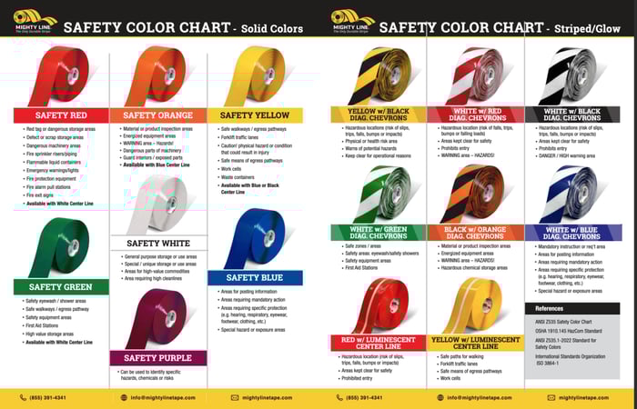
OSHA’s Standard 1910.144 outlines the core safety colors used in workplaces:
🔴 Red – Danger or Stop
Red is reserved for the most critical safety information. It signals immediate danger, emergency stop functions, or the location of fire protection equipment.
Examples of where red should be used:
Red is universally associated with “stop” or “danger,” making it essential for urgent response situations.
🟡 Yellow – Caution
Yellow warns of physical hazards such as tripping, falling, or striking against objects. It is also used to highlight potential dangers from machinery or pathways.
Common uses include:
In specific industries, like pulp and paper mills, OSHA (1910.261) mandates yellow paint on crane booms to improve visibility and reduce the risk of contact.
🟠 Orange – Warning
Orange is used to signal parts of machines or equipment that could cause serious injury through cutting, crushing, or electric shock. It draws attention to potentially hazardous components requiring heightened awareness.
You’ll see orange used on:
Beyond 1910.144: Additional OSHA & ANSI Colors
While OSHA directly regulates red and yellow under 1910.144, ANSI Z535.1 complements OSHA by standardizing a broader range of colors for specific safety purposes. These aren't strictly enforceable by OSHA but are widely recognized and adopted across industries.
🔵 Blue – General Information / Notices / Mandatory Action
Blue is used to communicate general information that does not relate to immediate personal injury or physical hazards. In safety communication, this color often designates mandatory actions, equipment status, procedural instructions, or informational signage.
It’s commonly found on:
Unlike red, yellow, or orange — which demand immediate caution or danger awareness — blue signals the need for attention, but not urgency. It’s intended to inform, instruct, or guide rather than to warn.
🟢 Green – Safety Equipment and Egress
Green identifies safe conditions and emergency resources. It marks:
This color reassures employees and helps them locate life-saving resources quickly in emergencies.
🟣 Purple – Radiation Hazards
Purple is reserved for areas or containers involving ionizing radiation. This includes:
This usage often overlaps with signage requirements under other agencies like the NRC (Nuclear Regulatory Commission), but OSHA recognizes purple as part of comprehensive hazard communication.
⚫⚪ Black & White – Housekeeping and Traffic Control
Black, white, or a combination of both is often used to direct internal traffic flow and housekeeping zones.
Applications include:
These markings are key for implementing Lean 5S methodology and improving workflow organization.
Implementing OSHA Color Coding in the Workplace
A consistent and effective color-coding program requires more than just paint or tape. It must be part of a well-designed safety management strategy.
Step 1: Perform a Hazard Assessment
Conduct a thorough inspection of your facility to:
Step 2: Develop a Visual Communication Plan
Create a facility-specific color guide that includes:
Use ANSI Z535.1 as a reference for expanded color usage beyond OSHA’s minimum.
Step 3: Train Employees
Even the best signage won’t help if employees don’t understand what it means. Train all team members on:
Step 4: Maintain and Update
Regularly review and update your visual safety tools to:
The Role of Floor Marking and Visual Aids
Floor marking products like Mighty Line’s heavy-duty tape play a critical role in visually reinforcing OSHA safety colors. These durable, color-coded solutions help:
Visual aids, such as labels with accompanying icons or text, further enhance comprehension. For example, using a red fire extinguisher sign with both the word “FIRE” and a graphic helps overcome language or literacy barriers.
Final Thoughts
OSHA’s color standards are more than compliance checkboxes — they are a proactive tool to foster safety awareness, reduce injury risks, and streamline emergency response. By applying the appropriate safety color codes in your facility, you improve not only regulatory compliance but also worker confidence and operational efficiency.
Remember: visual safety systems are only as strong as their clarity and consistency. Review your facility's color code use and consider how enhancing it might protect your workforce — and your bottom line.
For heavy-duty floor marking tape and visual communication products built to meet OSHA and ANSI color standards, be sure to explore what Mighty Line has to offer!