No Products in the Cart
We have been busy creating new products - Take a look here New Products

Walk into a well-organized warehouse, distribution center, or manufacturing facility, and one of the first things you notice may be the extensive use of ANSI-aligned safety colors on the floor. Yellow-striped walkways, red fire protection zones, green emergency equipment areas, and blue information or storage zones are not merely decorative. They are part of a visual communication system designed to improve safety, efficiency, and operational consistency.
When based on recognized standards such as ANSI Z535.1-2022, these markings become even more effective because they rely on widely understood color conventions. The result is a workplace that is safer, easier to navigate, and more productive.
Why Safety Colors Matter
We process visual information remarkably quickly. Long before a worker reads a sign or receives verbal instruction, color can communicate important information about the surrounding environment.
That is one reason safety colors are an essential part of industrial safety programs. When colors are used consistently throughout a facility, employees learn to recognize their meanings almost instantly. This rapid recognition improves awareness, reduces confusion, and supports faster decision-making.
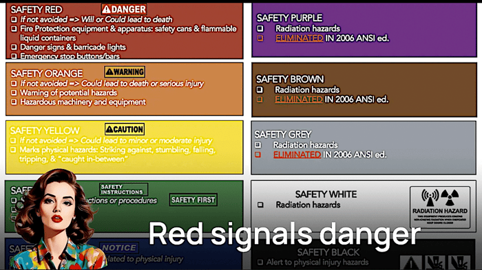
ANSI Z535.1-2022 establishes recognized safety color definitions commonly used throughout the United States. These meanings provide a foundation for many workplace visual management systems.
For example:
When employees encounter these colors repeatedly and consistently, they begin to recognize the message immediately.
Understanding the Difference Between Yellow and Orange
One area that often creates confusion is the distinction between yellow and orange. Although both are associated with safety warnings, they generally communicate different levels of concern.
Yellow is commonly used to indicate caution. It tells workers to stay alert because a potential hazard may exist. Examples include pedestrian crossings, traffic lanes, intersections, and other areas that require increased awareness.
Orange typically signals a more serious hazard, especially those involving machinery, energized equipment, or other risks that could lead to severe injury if proper precautions are not followed.
Understanding this distinction helps organizations create more meaningful visual cues throughout their facilities. Workers can assess risk more effectively when color assignments remain consistent and aligned with established standards.
Many facilities further improve visibility by pairing yellow and orange with black striping, diagonal patterns, or chevrons. These high-contrast combinations attract attention quickly and help warnings stand out in busy industrial environments.
ANSI and ISO: Better Together
While ANSI standards provide the color framework commonly used throughout North America, many organizations also incorporate international standards into their safety programs.
Two of the most influential international standards are ISO 3864 and ISO 7010. ISO 3864 provides guidance on the design and application of safety signs and symbols, while ISO 7010 establishes standardized safety pictograms that can be recognized regardless of language.
In today's diverse workforce, this can be especially valuable.
Warehouses often employ personnel with varied language backgrounds. Contractors, visitors, temporary workers, and vendors may also move through facilities regularly. Standardized symbols help communicate critical safety information even when language barriers exist.
When ANSI safety color standards are combined with ISO pictograms and symbols, facilities gain a more complete visual communication system. Employees receive consistent messages through both color and imagery, improving understanding and reducing the likelihood of misinterpretation.
Supporting 5S, 6S, and Lean Initiatives
Many organizations initially view floor marking as a compliance requirement. However, leading facilities recognize that effective floor markings also support broader operational goals, particularly within 5S, 6S, and Lean management programs.
Visual management is a core principle of Lean thinking. The objective is simple: make information visible so employees can quickly understand the status of operations and identify abnormalities. Floor markings play a critical role in achieving that goal.
Clearly marked pedestrian pathways help separate people from vehicle traffic. Designated pallet locations reduce clutter and support inventory accuracy. Defined equipment zones improve organization and reduce wasted motion. Hazard boundaries help employees recognize areas that require additional caution.
When visual controls are standardized and maintained, they contribute to safer, more predictable workflows. Rather than relying only on written procedures or employee memory, organizations create an environment in which the workplace itself communicates expectations.
Common Warehouse Applications
Although every facility has unique requirements, many warehouse floor-marking programs follow similar color conventions.
Yellow is frequently used for travel lanes, forklift routes, and pedestrian walkways. These markings establish traffic-flow patterns and help separate workers from moving equipment.
Red often identifies hazard zones, fire extinguisher locations, and fire protection equipment areas. These markings help ensure emergency equipment remains accessible and visible.
Green commonly marks first-aid stations, eyewash stations, emergency equipment, and designated egress routes. The color reinforces the association with safe conditions and emergency assistance.
Blue may identify inspection areas, quality-control zones, lockout/tagout locations, or areas requiring specific actions before proceeding.
Black, white, and gray frequently support organizational activities such as pallet storage locations, rack identification, staging areas, and inventory flow management. However,
White is most commonly used for walkways marked with “zebra stripes,” “stop bars,” and advance-warning “triangles” in areas with vehicle traffic, including powered industrial trucks.
The key is consistency. Once a color scheme is established, employees should be able to predict the meaning of markings throughout the facility.
The Power of Contrast and Pattern
Color alone is not always enough.
Industrial environments often include varying lighting conditions, heavy traffic, and numerous visual distractions. To improve visibility, many organizations combine color with patterns that reinforce the intended message.
Diagonal striping, chevrons, diamond plate, unique centerlines (e.g. glow-in-the-dark or reflective), and contrasting colors can significantly increase attention and recognition.
Certain high-contrast combinations such as yellow and black, orange and black, red and white, or black and white are commonly used because they remain highly visible from a distance. These patterns help distinguish important areas and draw attention to conditions that require immediate awareness.
The goal is not simply to add more markings. Rather, it is to make critical information easier to recognize and understand.
Creating a Sustainable Safety Color Program
The most effective warehouse safety color programs are not created randomly. They are developed intentionally, documented clearly, and maintained consistently over time.
Organizations should establish standardized color assignments, train employees on their meanings, and conduct periodic audits to ensure markings remain visible and accurate.
As operations evolve, floor markings should evolve as well. New equipment, revised workflows, and facility expansions may require updates to visual controls.
When integrated with ANSI guidance, ISO standards, and Lean principles, a well-designed floor-marking program becomes far more than a compliance exercise. It becomes a practical communication tool that supports safety, productivity, and operational excellence.
Ultimately, the value of safety color extends beyond aesthetics. It helps facilities communicate critical information quickly, clearly, and effectively. Whether identifying a pedestrian walkway, defining a forklift lane, organizing inventory, or highlighting a hazard boundary, the principle remains the same: color communicates before words are needed.