No Products in the Cart
We have been busy creating new products - Take a look here New Products


When we selecting colors for a safety application, it is easy to think of the decision as primarily visual or aesthetic. But in a workplace, color can do much more than make a marking stand out. It can influence what people notice, how quickly they interpret their surroundings, and ultimately how they respond to hazards and operational conditions. That raises an important question for safety, health, and operations professionals: What actually makes a safety color effective? The answer is more complicated than simply choosing the brightest color.
It is tempting to assume that the brightest or most vivid color will always provide the greatest safety benefit. But visibility is not that simple. Research examining vehicle color and crash involvement has produced mixed findings. One particularly interesting study examined approximately 16,700 Singapore taxis over a 36-month period. The fleet included yellow and blue taxis, and the yellow taxis experienced approximately a nine percent lower accident rate. Because drivers were randomly assigned to vehicle colors within the same fleet, the study provided evidence that vehicle visibility contributed to the difference. The lesson is not that yellow is always safer than blue, or that one color is inherently safe while another is dangerous. The more important lesson is that conspicuousness can be a meaningful component of risk control. And conspicuousness is not the same thing as brightness. How readily a color is detected depends on factors such as contrast with the background, illumination, viewing angle, object size, visual clutter, and the observer's ability to detect and interpret the visual signal.
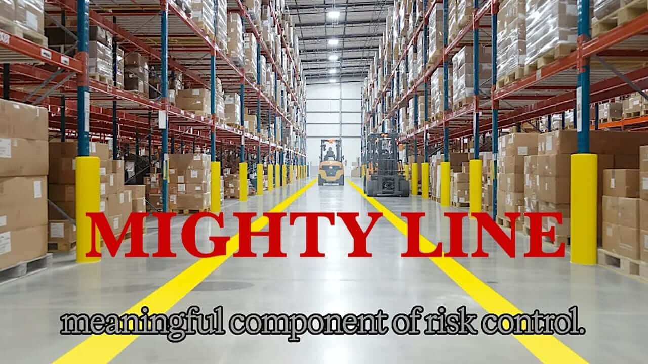
That distinction is particularly important in industrial environments. Walk through a modern warehouse or manufacturing facility and consider everything competing for an employee's visual attention: machinery, racking, inventory, pedestrians, powered industrial trucks, shadows, doors, equipment, signs, structural components, and constantly changing activities. A color that appears highly visible on a product sample in an office may perform very differently on a busy warehouse floor. This is why safety professionals should evaluate color in the environment where the color will actually be used. The question isn't simply, Does this color look good? A better question is: Will this visual signal be detected, understood, and acted upon when people need it most?
When evaluating safety or 5S colors, four fundamentals deserve particular attention: contrast, conspicuousness, recognition, and consistency. Contrast provides visual separation between a marking and its surroundings. Conspicuousness determines how readily the marking attracts visual attention, particularly when people are viewing an area peripherally, when illumination changes, or when multiple visual distractions compete for attention. Recognition gives the color meaning. And consistency ensures that the same visual conventions are applied throughout the facility. That last principle may be the most important of all.
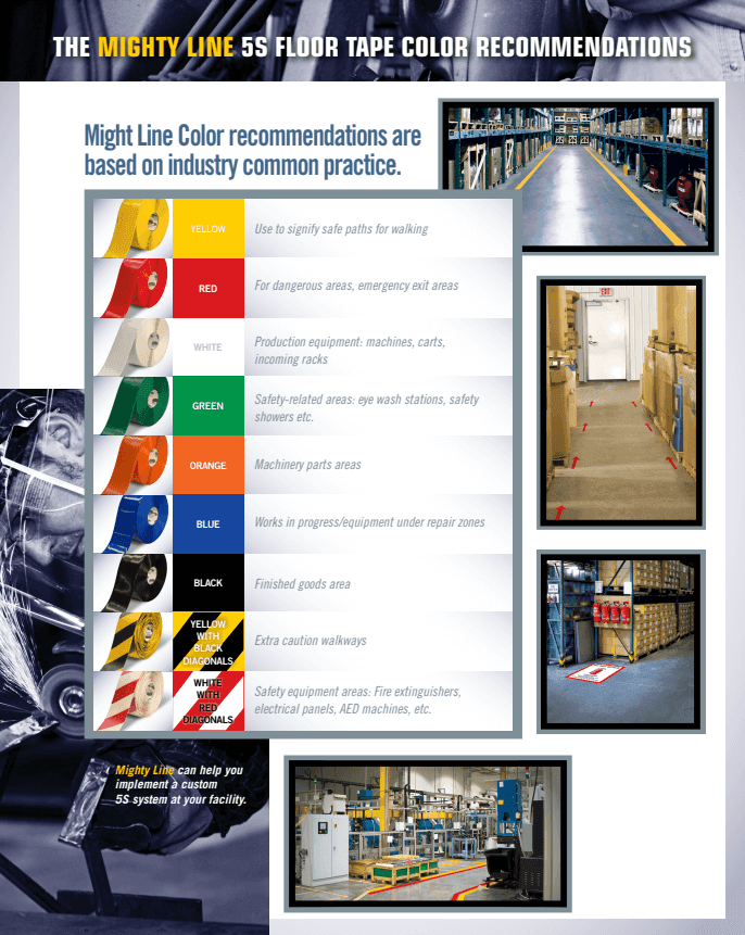
Consider a traffic signal. Red means stop. Yellow means caution. Green means proceed. We do not need to consciously analyze those colors every time we approach an intersection because their meanings have become standardized and deeply familiar. Industrial environments can benefit from the same principle. Recognized safety standards establish common color conventions so that colors can communicate consistent meanings. In general industrial safety applications, yellow is associated with caution, orange with warning, red with danger, green with safety, and blue with notice. The value comes not simply from the colors themselves, but from applying them consistently. When pedestrian routes are clearly differentiated, powered industrial truck lanes are consistently identified, exclusion zones are visually distinct, and hazards are marked using an established color system, the physical environment begins to communicate expectations—before a sign is read, a procedure is recalled, or an instruction is spoken.
This is where color moves beyond aesthetics and becomes part of a broader safety strategy. Human beings continuously process visual information, and in a busy operational environment employees must identify hazards, recognize pathways, understand boundaries, and make decisions while simultaneously performing their primary tasks. Effective visual communication can reduce the mental effort required to interpret the environment. That makes color a potential human factors, engineering, and risk-management tool. Color should never be considered a substitute for other controls; a colored floor marking does not replace machine guarding, pedestrian separation, training, procedures, or appropriate engineering controls. Instead, properly selected and consistently applied color can reinforce those controls and become another layer in the overall safety system.
One of the most important lessons for safety and operations professionals is that there is no universal "best" safety color independent of context. The effectiveness of a color depends on where it is used and what it must communicate. What is the surrounding background? How is the area illuminated? How much visual clutter exists? Will employees see the marking directly or primarily through peripheral vision? Is the marking large enough to be detected at the necessary distance? Does everyone understand what the color means? These are operational questions—not simply design questions. The goal should be to select visual characteristics that communicate the intended message reliably, consistently, and under the actual conditions in which people are making decisions.
The 1939 school bus decision provides a remarkably enduring lesson. The officials responsible for developing a national standard did not simply pick a color because it looked attractive. They considered how people would see and recognize the buses in the real-world conditions in which they operated. That same philosophy remains relevant today. Whether we are selecting colors for warehouse floor markings, pedestrian routes, equipment identification, hazard zones, 5S applications, or other safety controls, color deserves thoughtful consideration. The right question isn't simply, "What color should we use?" It is: "What visual signal will communicate the intended message most effectively in this environment, to the people who need to recognize it?"
When color is deliberately selected, scientifically evaluated, standardized, and matched to the environment and the human task, it becomes more than appearance. It becomes part of the safety system—and contributes to operational excellence.
Learn more about Mighty Line's approach to industrial visual management and durable floor marking at Mighty Line.